Brief
GO OUT
Go Out is a free app that recommends you where you can go out in Dubai. It gives users recommendations on what bars they will more likely enjoy, based on its intel gathered from where people like you are hanging out.
Problem
iterate, iterate, iterate
It’s a common behavior in startups iterate and keep improving the product once is released. Go Out took advance of one of this iterations to make a rebranding of the brand and update the app with a completely new design.
Challenge
understand cultural differences that could impact on the ui and addapt them their business needs
A night app, for Middle-East with European and Middle-East users with completely different patterns for going out was the perfect cocktail for a long research on this project.
"If you're not embarrassed by the first version of your product, you’ve launched too late". The world famous lean quote for startups fits perfectly into this project. It’s easy to succumb to the temptation and catch a glimpse of their roadmap to include everything in the designs.
Rebranding
GO OUT needed an aesthetic update urgently
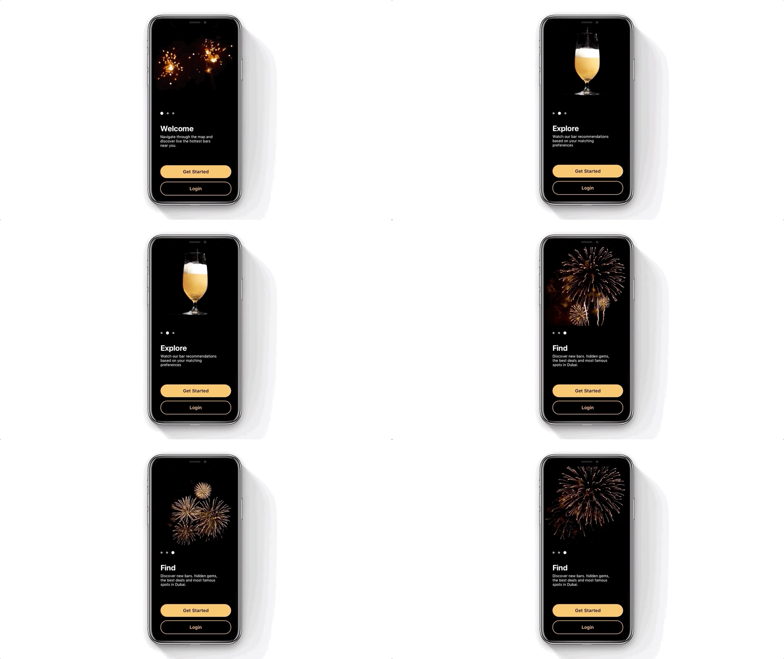
The app weren’t attractive at all and we decided to make a whole rebranding thinking in the night and dark mode patterns that could fit on and give the app a visual upgrade.
User Flow
embracing the laziness during the sign up process
In order to improve the on-boarding flow and increase the usability of the app, we decided to analyze how it was going to be the main actions and screens that the user should follow.


